
IELTS Academic Task 1 Table Tips (2026)
Handle IELTS Academic Task 1 tables by scanning units, finding extremes, grouping rows or columns, selecting key figures, and writing a cautious overview.
Scan units, labels, and the shape of the table
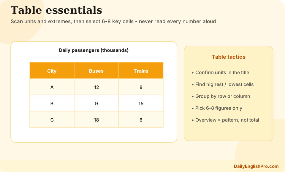
Tables pack a lot of numbers into rows and columns. Before writing, confirm the units, time labels, and whether figures are totals, averages, or percentages. Misreading a unit is one of the fastest ways to damage Task Achievement. Also notice whether the table is wide with many categories or deep with many years.
Spend a minute finding the highest and lowest values overall, then the extremes inside each important row or column. Those anchors become the overview and the skeleton of your detail paragraphs.
Write an overview without forcing a story
A table overview should report patterns that are visibly present: the highest category, the lowest category, a column that is generally larger, or a year that stands out. Avoid phrases that imply movement when the data are static. There were significant differences across age groups is acceptable; sales rose rapidly is not, unless years show that rise.
When the table does include several years, summarise the dominant direction for key rows and note any row that behaves differently. Keep numbers out of the overview so the paragraph stays high level.
| What the table shows | Safe overview focus | Unsafe leap |
|---|---|---|
| One year, many categories | Highest and lowest categories | Claiming growth over time |
| Several years for one measure | Overall rise, fall, or mixed movement | Ignoring a clear exception row |
| Countries and years | Leading country and general direction | Explaining economic causes |
| Percentages by group | Which group dominates | Treating percentages as raw counts |
Group rows or columns, then select 6 to 8 figures
You cannot and should not report every cell. Choose a grouping logic: by highest rows, by year columns, or by related categories. Then select about six to eight figures that prove the overview. Supporting numbers should illuminate extremes, notable exceptions, and useful mid-range comparisons.
One practical method is to dedicate body paragraph one to the top-performing categories or years and body paragraph two to lower values and exceptions. Another method is to move year by year only when there are few columns and clear staged change. Whatever plan you choose, make the grouping visible through topic sentences.
- 1Highlight extremesMark the maximum and minimum in the whole table and in key rows or columns.
- 2Choose a groupingDecide whether paragraphs will follow categories, years, or high-versus-low clusters.
- 3Pick 6 to 8 figuresSelect numbers that prove ranking, change, or exception. Leave the rest out.
- 4Write topic sentencesOpen each body paragraph with the group it covers before listing evidence.
- Use approximately or just over when exact reading across dense cells is awkward
- Compare related cells in one sentence rather than isolating every number
- Watch for totals rows that should not be treated as ordinary categories
- Keep units visible when switching between absolute numbers and percentages
Compare clearly and stay numerically honest
Comparison language matters as much in tables as in bar charts. Phrases such as was markedly higher than, showed little difference, and was the only category to decline help the reader navigate dense data. If two figures are close, acknowledge the similarity instead of overstating a gap.
Double-check that every quoted number matches the correct row and column. Mixed-up references are common under time pressure. A short end-of-task check of three cited figures against the table is worth the thirty seconds it takes.
Weak
Mechanical listing
In 2010 A was 12. In 2011 A was 14. In 2012 A was 15. In 2010 B was 9.
- •No grouping
- •Hard to see the pattern
- •Too many low-value figures
Stronger
Selective comparison
A remained the highest category throughout, rising from 12 to 15, while B stayed lower but narrowed the gap slightly by 2012.
- •Clear hierarchy
- •Selected figures
- •Meaningful contrast
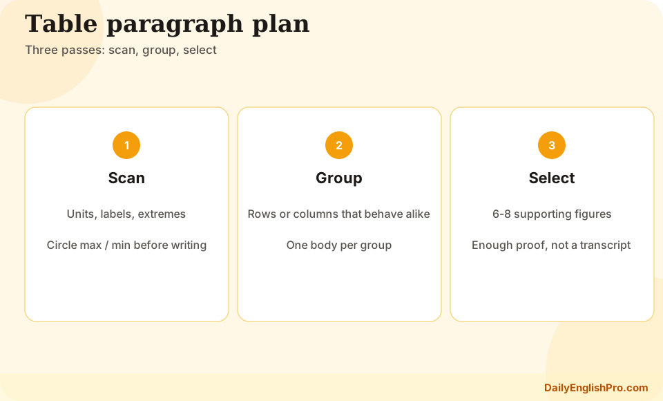
Table FAQ and practice focus
Practise with one static comparison table and one multi-year table. For each, write only the overview and a bullet plan of eight figures before drafting full sentences. This trains selection under pressure.
Do I need to mention every number in the table?+
No. Select around six to eight key figures that support the overview. Full coverage is neither required nor desirable.
How do I write an overview for a table with no years?+
Focus on highest and lowest categories, broad ranking patterns, or columns that are generally larger. Do not invent trends over time.
Should I organise by rows or by columns?+
Choose the organisation that makes comparisons easiest. Many candidates group high versus low categories, or compare years when time is the main story.
What is a common table mistake?+
Misreading units, mixing up row and column references, and forcing a rise-and-fall narrative onto static category data.