
IELTS Academic Writing Task 1 Essential Tips
How to summarise IELTS Academic Writing Task 1 charts, maps and processes: the overview requirement, a four-paragraph skeleton, and how to split your 60 minutes against Task 2.
What Academic Task 1 requires
Academic Task 1 asks you to summarise visual information in at least 150 words, in around 20 minutes. Examiners want an accurate overview of the main trends or features, together with supporting comparisons, not every number copied into a sentence. Common visuals include line, bar and pie charts, tables, maps, and process diagrams.
Identify the visual type in the first thirty seconds so your overview language matches it: change over time for line and bar charts, static comparison for pie charts and tables, before-and-after for maps, and sequence for processes.
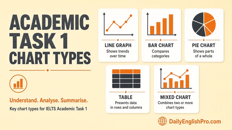
- Line charts - Change over time and selective data
- Bar charts - Category comparison and grouping
- Pie charts - Shares and combinations
- Tables - Scan, group and select key cells
- Mixed charts - One overview, one body per visual
| Visual | Overview focus | Body focus |
|---|---|---|
| Line or bar over time | Rise, fall or peak | Key years and the biggest gaps |
| Pie or static chart | Largest vs smallest shares | Grouping similar categories |
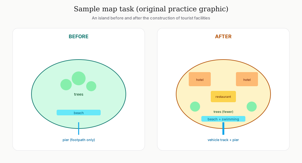
| Map | Main changes by area | Before compared with after, by location |
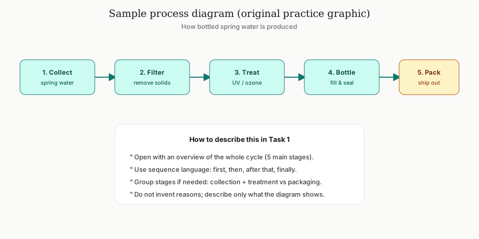
| Process | Start to end stages | Sequence and purpose of each step |
The four-paragraph skeleton
Paragraph one paraphrases the question: what the visual shows, without copying its wording. Paragraph two is the overview: two or three big-picture features stated without detailed numbers. Paragraphs three and four give selective details and comparisons that support the overview rather than repeating it.
- 1Scan (2 min)Note units, time span and categories. Circle extremes and obvious contrasts.
- 2Overview (3 min)Write two big-picture sentences before touching minor data.
- 3Details (12-13 min)Group data logically and compare rather than list every figure.
- 4Check (2 min)Confirm units, tense consistency, and that details still match the overview.
- Do not give opinions or reasons unless the prompt is a process implying purpose
- Approximate figures are fine when exact reading is unclear (about, just under, roughly)
- Vary comparison language: while, whereas, compared with, the largest
Charts and graphs: what to notice
For line and bar charts, scan for the overall direction first: is the trend rising, falling, fluctuating or flat, and where is the highest or lowest point. For pie charts and tables, group similar categories rather than describing every slice individually, and lead with whichever comparison is most striking, such as the largest share, the smallest share, or a category that stands out from the rest.
Maps and processes: what to notice
Map tasks usually show a location at two points in time or under two proposals. Organise your answer by area, this district changed while that one stayed the same, rather than jumping randomly between features, and use before-and-after language consistently. Process diagrams need a clear start and end point, sequencing language such as first, next, after this, finally, and a description of what happens at each stage rather than a guess at why it happens, unless the prompt itself implies a purpose.
- Confirm the compass direction or starting point on a map before writing
- Group changes by location, not by feature type
- On processes, check whether the sequence is linear or cyclical before you draft
- Use passive voice naturally where a process describes something being done rather than someone doing it
Task 1 vs Task 2 time split
Keeping Task 1 close to 20 minutes protects roughly 40 minutes for Task 2, which usually carries more weight in the overall Writing band. An unfinished Task 2 tends to cost more than a slightly shorter, well-organised Task 1 that still has a full overview and key comparisons.
Selective
Strong Task 1
Clear overview, accurate key figures, logical grouping.
- •150-190 words
- •Clear comparisons
- •Clean units
Data dump
Weak Task 1
Lists every number, skips the overview, or invents causes.
- •No big picture
- •Wrong or mixed units
- •Runs into Task 2 time
Language slips that quietly cost marks
Task 1 GRA errors often cluster around a handful of predictable patterns rather than spreading randomly across the response, because the task itself repeats the same grammatical demands: describing change over time, comparing quantities, and referring to a visual without narrating your own opinion.
| Error type | Example mistake | Fix |
|---|---|---|
| Wrong tense for the time reference | "The chart show that sales rises" for past data | Match tense to the stated time frame: rose, had risen, is projected to rise |
| Article misuse before nouns | "The overall trend show increase in the sales" | Check whether the noun needs "a", "the", or no article at all |
| Preposition with numbers | "increased in 20 percent" | Use "by" with amounts of change: increased by 20 percent |
| Confusing comparative forms | "more higher than" | Use one comparative form only: higher than, or much higher than |
- Re-read your overview sentence and confirm every verb tense matches the visual's stated time frame.
- Check each number for the correct preposition (by, to, from, of) before moving to the next sentence.
- Scan for doubled comparatives or superlatives (more easier, most biggest) in your final two minutes of checking.
Language patterns that raise Task 1
Strong Academic Task 1 writing uses comparison language, trend verbs and clear referencing without inventing causes. Prefer 'rose sharply', 'remained stable' and 'was higher than' over dramatic storytelling. For maps and processes, location and sequence phrases matter more than fancy vocabulary.
| Visual type | Useful language focus | Common error |
|---|---|---|
| Line / bar / pie | Rise, fall, peak, remain, roughly / about + units | Listing every year without grouping or comparing |
| Map / plan | North of, adjacent to, was replaced by, expanded to | Describing features with no location anchor |
| Process / cycle | First, then, after which, is heated, returns to | Skipping a stage or mixing active/passive awkwardly |
Practice loop for Task 1
Rotate visual types deliberately rather than practising only the chart type you find easiest, since Academic Task 1 can bring a line chart one week and a process diagram the next. A simple loop: scan and plan for five minutes, write a full response in twenty, then check it against Writing Checker before moving to a different visual type next session.
- 1Plan (5 minutes)Identify the overview message and two detail groups before you write the first sentence.
- 2Write (15 minutes)Introduction paraphrase, overview, then two body paragraphs with selective figures.
- 3Check (2 minutes)Units, tense, and whether the overview still matches the chart.
Do I need a conclusion?+
A separate conclusion is optional if your overview paragraph already captures the main trends. Do not add an opinion as a closing line; Task 1 is descriptive, not persuasive.
What about General Training Task 1?+
General Training Task 1 is a letter, not a chart summary. Use a letter's tone and bullet-point coverage instead of this Academic skeleton.
How exact do numbers need to be?+
Precise where the chart makes it easy to read, and clearly approximate elsewhere. Examiners want accurate reporting, not guessed decimal points from a hard-to-read chart.
Can I explain why the numbers changed?+
Only if the chart or prompt gives a reason. Do not invent economic or social causes that are not shown.