
IELTS Academic Task 1 Line Chart Tips (2026)
Describe IELTS Academic Task 1 line charts with clear overviews, selected key years, series comparisons, accurate tense, and a mini rising-line sample.
What a line chart asks you to do
An IELTS Academic Task 1 line chart shows how one or more values change across a period. Your job is to summarise the main trends and make meaningful comparisons, not to invent causes or list every plotted point. Examiners reward selection: you should highlight the overall direction, the biggest movements, and the clearest contrasts between series.
Start by reading the axes and units. Confirm whether the horizontal axis shows years, months, or another time scale, and whether the vertical axis shows percentages, numbers, or money. Note how many lines appear and what each line represents. Thirty seconds of careful reading prevents tense errors and wrong comparisons later.
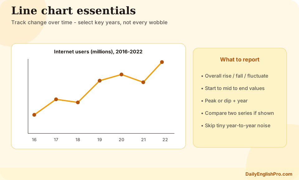
Write an overview that names the big picture
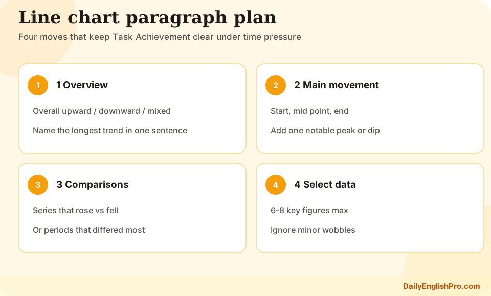
The overview is usually the second paragraph and should contain no detailed figures. State the dominant pattern: overall rise, overall fall, fluctuation, or a mix of directions across series. If two lines move in opposite ways, say that clearly. If one series stays roughly stable while another climbs, that contrast belongs in the overview.
Useful overview language includes rose steadily, declined overall, fluctuated throughout the period, and remained relatively stable. Pair direction with a broad comparison: Sales of tablets increased, while desktop sales fell. Avoid vague fillers such as there were many changes without naming what changed.
| Overview focus | Weak phrasing | Stronger phrasing |
|---|---|---|
| Direction | The figures changed a lot | Internet use rose steadily over the period |
| Contrast | The lines were different | Mobile use grew, whereas landline use declined |
| Stability | One line did not change much | Exports remained broadly stable after 2015 |
| Peak or low | There was a high point | Demand peaked around 2018 before falling |
Select key years instead of listing every point
Body paragraphs need selected evidence. Choose opening and closing values, major peaks or troughs, and years where the trend changes direction. If a line rises smoothly, two or three figures are usually enough. If it jumps sharply in one year, that turning point deserves a sentence.
Compare series at the same moments. For example, report that in 2010 product A stood at 20 units while product B was already near 45, then show how the gap narrowed or widened. Grouping by time segment often works better than describing each line from start to finish in isolation.
- 1Mark start and endNote the first and last values for each series so you can summarise the net change.
- 2Circle turning pointsHighlight peaks, troughs, and clear changes of direction rather than every yearly tick.
- 3Pick contrast yearsChoose one or two years where the gap between series is largest or reverses.
- 4Drop the restIgnore small intermediate points that do not change the story of the chart.
- Include roughly six to eight key figures across the whole response
- Use approximate language when exact reading is unclear: about, roughly, just under
- Group years into stages when the trend is continuous
- Avoid writing one sentence for every year on the axis
Compare series and control tense
When several lines share one chart, comparison is essential. Use while, whereas, compared with, and by contrast to show relative movement. Mention which series was highest or lowest for most of the period, and whether rankings changed. Absolute numbers matter, but relative language often carries the overview and body organisation.
Match tense to the time frame. Past years normally need past simple or past perfect for earlier reference points: rose, fell, had reached. Charts that include a forecast to a future year often mix past description of known data with present or future forms for projections: is expected to rise, is projected to reach. Do not use future tense for completed historical data.
Past forms
Historical data
From 2005 to 2015, energy use rose from 40 to nearly 70 units.
- •Past simple for finished periods
- •Past perfect for earlier reference if needed
Projection forms
Forecast segment
After 2024, consumption is projected to climb further to around 85 units.
- •Use expected to / projected to
- •Keep the forecast clearly signalled
Mini sample: a simple rising line
Imagine a chart showing average daily website visits from 2016 to 2022, rising from about 2,000 to just over 5,500. A concise description might begin: The line chart illustrates average daily visits to a website between 2016 and 2022. Overall, traffic increased substantially across the period, with the steepest growth after 2019.
A detail paragraph could then select key years: Visits started at roughly 2,000 in 2016 and edged up to around 2,800 by 2019. After that, the figure climbed more sharply, reaching approximately 4,200 in 2021 and finishing just above 5,500 in 2022. This sample uses four figures, names the main stages, and never lists every year.
Line chart FAQ and next practice
Practise by timing a two-minute scan, writing only the overview first, then adding selected figures. Check that your body paragraphs do not repeat the overview with numbers alone. When you are ready, draft a full response and review it for tense consistency and over-listing.
Do I need to mention every year on a line chart?+
No. Select start and end points, major peaks or troughs, and clear turning points. Listing every year wastes time and weakens Task Achievement.
Should the overview include exact figures?+
Usually not. Keep the overview for overall direction and big contrasts. Put selected numbers in the detail paragraphs.
How do I handle multiple lines?+
Group by trend family or by time segment. Compare series at shared years instead of finishing one line completely before noticing the others.
What tense should I use for forecasts?+
Describe completed years in the past. For projected years, use forms such as is expected to rise or is projected to reach, and make the forecast clear.