
IELTS Academic Task 1 Bar Chart Tips (2026)
Master IELTS Academic Task 1 bar charts with category comparison, grouping, highest and lowest values, dual-bar tips, and a clear overview routine.
Read categories before you compare numbers
Bar charts usually compare categories rather than continuous change, although some also show different years. Your first task is to identify what each bar represents, what the scale measures, and whether bars are single, grouped, or stacked. Accurate category names in the paraphrase set up clear comparisons later.
Decide whether the main story is ranking (which category is highest), distribution (how values spread), or contrast across groups such as men and women or two years. That decision controls your overview and body paragraph plan.
Build an overview from extremes and patterns
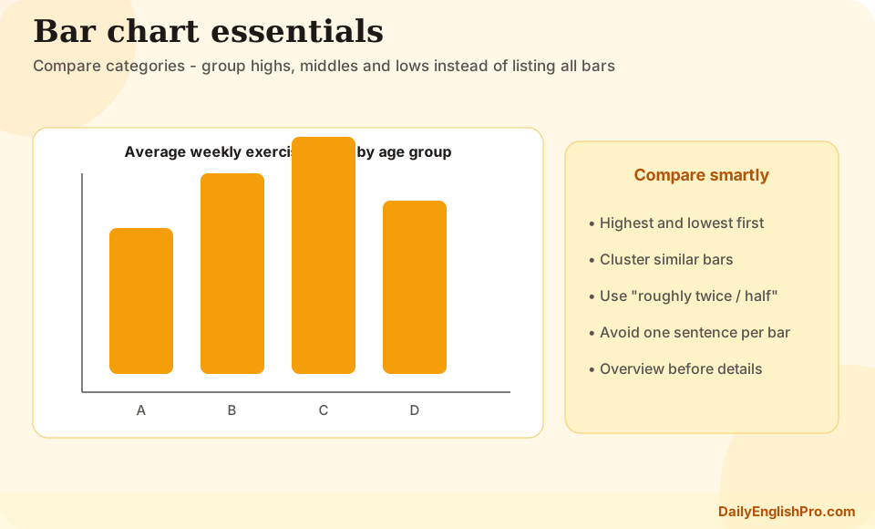
A useful overview names the largest and smallest categories and one broader pattern, such as leisure spending being generally higher than education spending, or city A exceeding city B in most categories. Do not list every bar. Two or three overview statements are enough.
If the chart shows two years, say whether most categories rose, fell, or stayed similar, and identify any category that moved against the main pattern. If the chart is a single year, focus on ranking and clustering rather than inventing a trend over time.
| Chart type | Overview priority | Detail priority |
|---|---|---|
| Single-year bars | Highest and lowest categories | Close mid-range values and clear gaps |
| Two-year bars | Overall rise, fall, or mixed change | Biggest movers and stable categories |
| Grouped dual bars | Which group leads overall | Within-category contrasts that matter |
| Many categories | Top cluster vs bottom cluster | Select 6 to 8 figures, skip tiny differences |
Group categories instead of listing left to right
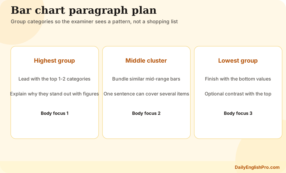
Left-to-right description is a common trap. Group high-value categories together, then cover a mid group, then the lowest values. Alternatively, organise by theme if categories naturally cluster, such as transport modes or age groups. Grouping shows that you can select and organise information.
When two values are almost identical, say they were similar rather than inventing a dramatic difference. Save precise figures for contrasts that change the ranking story. Approximate language is acceptable when bars sit between labelled scale points.
- 1Rank the barsQuickly order categories from highest to lowest, or note the top three and bottom three.
- 2Form groupsPut close values in one sentence and keep outliers for separate emphasis.
- 3Select figuresChoose about six to eight numbers that prove the ranking and main gaps.
- 4Write by groupGive each body paragraph one group or one comparison job.
- Highest and lowest categories almost always deserve mention
- Mid-range bars can be summarised together when differences are small
- Do not describe every category if the chart is crowded
- Keep category names accurate; do not invent shorter labels that change meaning
Handle dual bars and year pairs carefully
Dual-bar charts often compare two groups within each category, such as male and female participation, or spending in 2010 and 2020. In the overview, state which group is generally higher and whether the pattern is consistent. In the body, compare within categories first, then note any category where the usual pattern reverses.
Avoid writing separate mini-reports for each colour. A sentence such as In sports, women recorded about 40 percent while men were closer to 28 percent is stronger than two disconnected sentences. Use respectively only when the order of references is unmistakable.
Avoid
Weak dual-bar habit
Describe all blue bars, then all orange bars, with little direct comparison.
- •Harder to follow
- •Misses within-category contrast
- •Feels like two charts
Prefer
Strong dual-bar habit
Compare the two bars inside each important category, then generalise the wider pattern.
- •Clear pairing
- •Shows ranking and gap
- •Supports a compact overview
Language for ranking and gaps
Reliable ranking phrases include was by far the highest, ranked second, was slightly higher than, and was the least popular. Gap language such as almost twice as high, a narrow difference, and roughly the same helps you show scale without listing every value. Pair these phrases with selected figures so the claim stays grounded.
Keep grammar simple and accurate. Past simple is common for completed survey years. Present simple can fit timeless single-year charts presented as current data, but stay consistent once you choose a tense. Do not speculate about reasons for the differences.
Bar chart FAQ and practice path
Use a published model to check organisation, then write your own response under time pressure. Focus feedback on grouping and overview quality before polishing rare vocabulary.
Should I describe bars from left to right?+
No. Group by size, theme, or comparison job. Left-to-right order often produces mechanical listing and weak cohesion.
How many figures should a bar-chart answer include?+
About six to eight carefully chosen numbers are usually enough. Extremes and major gaps matter more than complete coverage.
What if two bars are almost the same height?+
Say they were similar or nearly equal. Do not invent a meaningful difference the chart does not support.
How do dual bars change the plan?+
State which series is generally higher in the overview, then compare paired bars inside key categories in the body.